Arch
443/646: Architecture and Film
Fall 2014
Playtime (1967)
Jacques Tati, director
|
Arch
443/646: Architecture and Film Playtime (1967) |
|
Discussion
Questions: For this set of questions you are given an image, sequence or set of images from the film. Prepare a critical commentary describing the significance of these images as they pertain to the film itself (production, technique, plot), to the critical commentary that Tati is making about Modern Paris. Reflect on his use of f/x and sound in the film in particular. Feel free to refer to any of the films we have already viewed this term for comparison purposes. What makes this film iconic? Each thumbnail below is linked to a larger screen capture of the same image in case you need to see the image in greater detail. Your name is BELOW the series you are assigned. For the in class discussion, please paraphrase your answer. Log-in to LEARN: here |
link to extra reading on this film
please also read "Architecture in a Mode of Distraction" on page 171 in Mark Lamster's Book, Architecture and Film (should be in the library).
| x | 1. |  |
 |
 |
x |
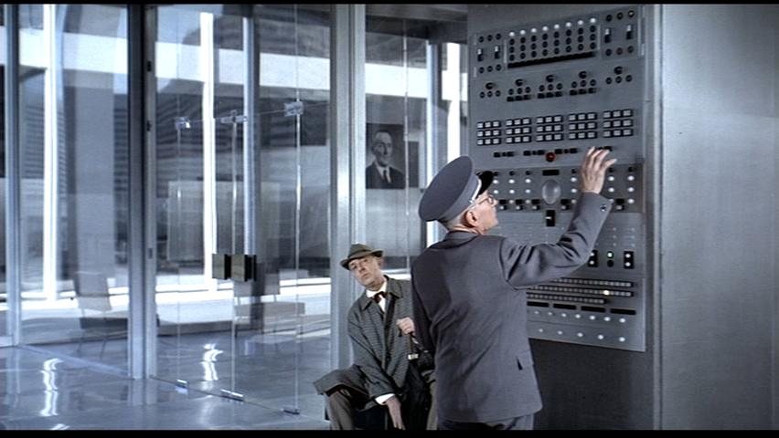
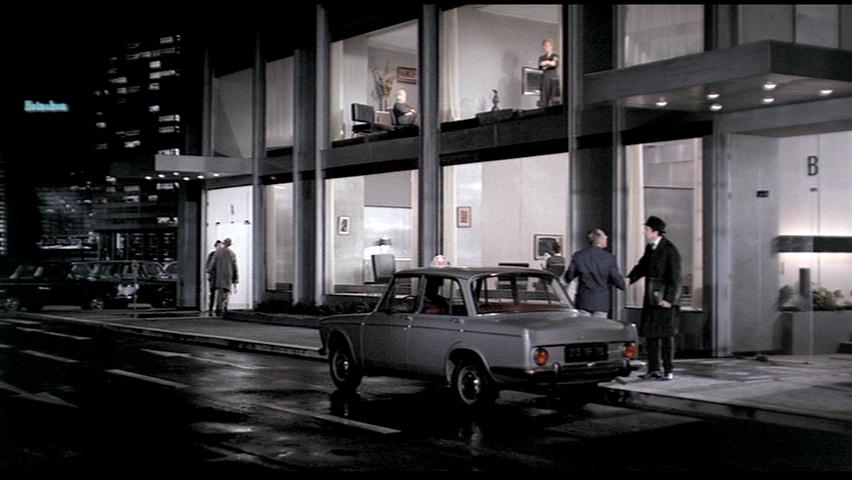
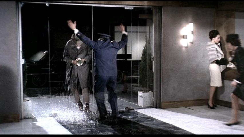
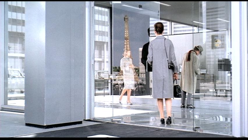
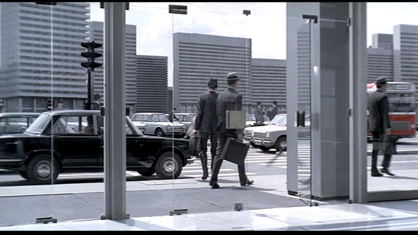
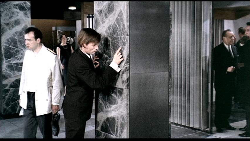
Hillary Chang -image set is ABOVE The first image in my sequence is when Hulot wanders into the elevator without knowing what it was, and ends up ascending without Giffard. The second image is when Hulot is waiting to be announced by the aged doorman, and the doorman has trouble figuring out how to call Giffard using the machine in the wall, which makes a series of beeps and loud noises as he presses the wrong buttons. The third image is from the opening sequence of the film as the tourists enter the station. These images show Hulot's confusion with modern technology. This reflects Tati's commentary on modern Paris; with all kinds of new technological advances, people who are unfamiliar with these new advances come into difficulty when presented with them, resulting in comedic confusion. As Hulot steps into the elevator to read the sign, the doors close and he misses Giffard again. This annoys Giffard through the whole scene as Hulot's confusion with this new city keeps him from Giffard. Similarly, the doorman struggles to remember which buttons were the right ones to press; there were too many for one machine and especially with no distinctions other than lighting up and bleeping angrily when he pressed the wrong one. Tati also makes a commentary on the architecture of the modern city, by filling his set with grey walls, shiny floors and glass walls Tati emphasizes the banality of "sleek modernity" and modernity's elimination of a few fundamental aspects of architecture. Hulot's confusion also stems from the lack of defining architectonic elements that dictated the small room as an elevator. In the doorman scene, the buttons on the wall are also placed in a uniform grid, with few differences causing the doorman to muddle up the order. The lack of privacy of modern Paris is shown with the extensive use of curtain walls, as well as the lack of separating wall between the hallway and the bathroom in the last image. The lack of walls and the transparency of the curtain walls blurs the indoor and outdoor spaces, causing many characters to confuse them with when the walls were taken out, causing them to bump into them. The f/x Tati uses are very simple but effective. His use of sound in the second image's scene emphasizes the doorman's error, it also enhances the doorman's frustration with the machine as it bleeps angrily at him. The film is overall very quiet, allowing viewers to focus on the visual effects and comedic moments that happen with the character's interactions with the architecture. Tati uses clever framing and lighting to take advantage of reflections in windows and off the floor to enhance his commentary on the banality of modernity.
|
|||||
| 2.
|
 |
 |
 |
||
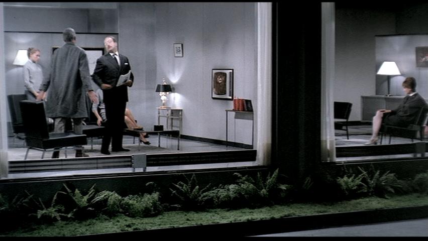
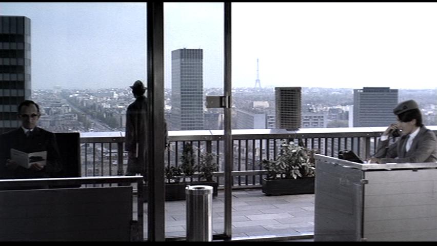
Patrick Cheung -image set is ABOVE The first two images in the set show a block of apartment buildings that friend of Hulot's lives in. These apartments feature floor to ceiling, wall to wall windows that face the street. Sounds from the apartment cannot be heard from outside. During this scene, Hulot and his friend are watching a television that's mounted in the wall separating his apartment from his neighbor's. His neighbor is watching a television mounted on the same wall in his apartment. The final image shows the American tourist Barbara in her hotel room, with a similar looking window facing the street. These scenes both depict places that are supposed to be private, though are completely exposed to a public audience through the floor to ceiling, wall to wall windows. Both settings are supposed to be places of comfort, though are made uncomfortable not only by the lack of privacy but also by the furniture. The apartments feature the modern rectilinear chairs that don't quite squish like normal seats and couches, but pop in and snap back out. The hotel room looks uncomfortably small and features a rectilinear bed that looks equally as uncomfortable as the chairs. Both these sets show how the desire for new, luxurious, and cleanly designed homes and furniture can get in the way of human comfort. Just because people can create large, wall-sized windows, or rigid chairs that retain their shape through stiffness, does not mean that they should. It is almost impossible to live a comfortable life in these settings.
|
|||||
| 3. | 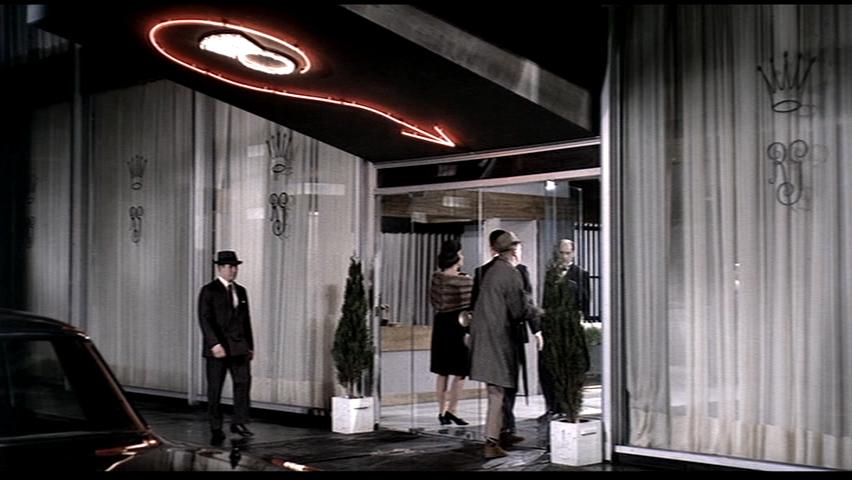 |
 |
 |
||
Charlie Gao -image set is ABOVE
|
|||||
| 4. |  |
 |
 |
||
Maighdlyn Hadley -image set is ABOVE
|
|||||
| 5. | 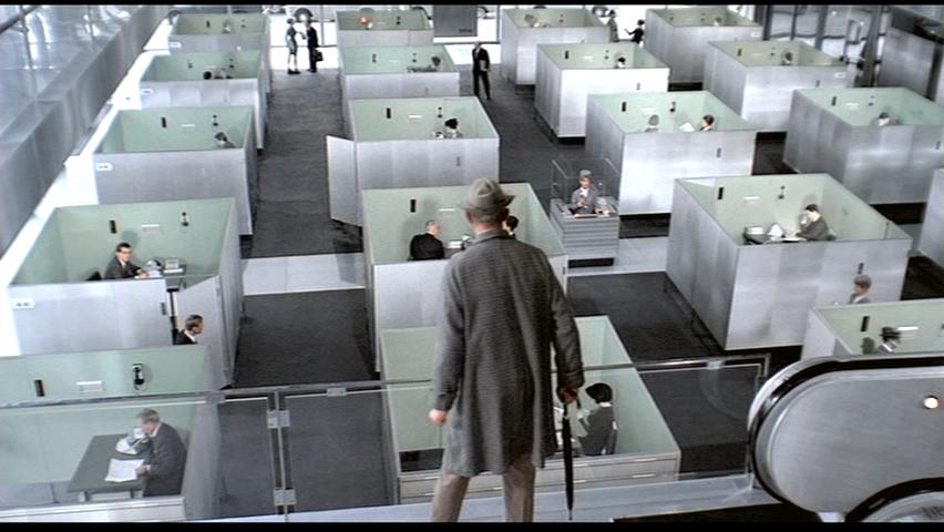 |
 |
 |
||
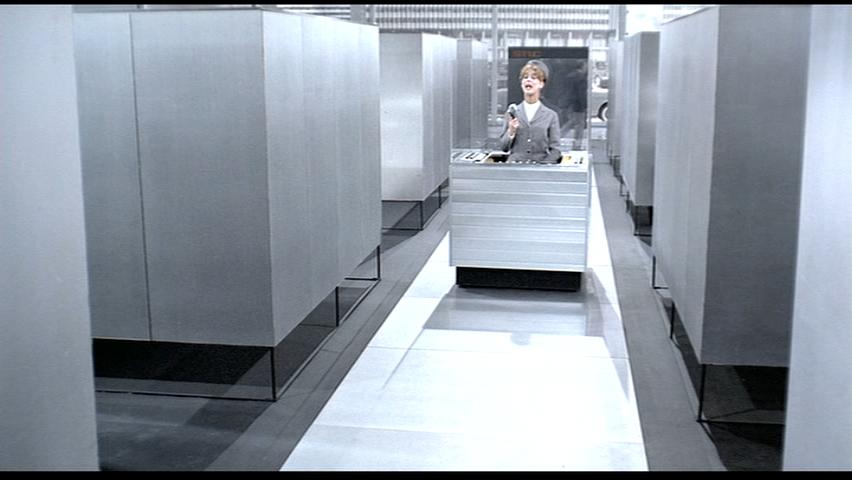
Dan Kwak -image set is ABOVE Tati deploys various techniques and elements to portray the ridiculous monotony of working scene of modern Paris. The most obvious is the architectural plan of uniform box offices and the workers of their ants-like movements as Hulot sees from above. It is absolutely in order and in such a repetitive condition to the point of ridiculousness. The machine-like working behaviour and the way people move and execute their business; as seen from the image of the woman in a tiny box in constant rotations while answering phone calls, Tati makes it extra clear to the audience by this extravagant emphasis of such a rigid setting of working conditions. So is it shown in the structural sense – the absolute-clean glass walls, the gleaming floors and seemingly-thin posts and beams without any ornament. No ornament, for typical Parisien, is most apparently absurd; not only so, this lack of any personal “touch” even further depicts the atmosphere mechanical and industrious. Most of all, everything is in grey. Not only the whole building is grey, the office boxes, the furniture and so on all convey the monotonous grey and black. This colourless setting makes the atmosphere dull and desaturated – wholly desaturated of any life! The second obvious is Hulot’s reaction to this setting – how he is lost while his attendance roams the maze in an equally lost pace. Hulot ravels the whole building and even so involuntarily by the hook of other characters in the setting. The audience can understand why it would be so easy to get lost; yet, Hulot’s awkward movements and his acting even further make it deliberately humorous. Also, Tati occasionally switches between a third person perspective and Hulot’s perspective to place the audience in its humorous position: if you were Hulot, would you really not act and feel the same way? Not only is the setting baffling for Hulot; the other characters, who should be adapt to the conditions, are also equally confused. For example, the attendance is also seemingly lost while hurriedly trying to execute business in and out of the boxes. An easy execution of telling how much is in an account, the client is calling on a phone in a box while the attendance answers in another; which are only a distance away. What is laughable about this scene is its obvious flaw in efficiency despite of its utmost, efficient setting and how this profound efficiency is similarly confusing its own natural inhabitants. Third, the constant mixture of murmurs and this brainwashing office song even further elaborate on the whole banality. Especially for a non-French speaker, the entire jumbling murmur and its cohesive assimilation with the constant phone rings and the sound of shuffling paper, become alienating. And there is that euphoric, soft and gentle but endlessly consistent music that plays as Hulot roams the maze. Given this hyper-monotonous setting and indifferent atmosphere, the audience can rely on following the rhythm of the music for progressing the narrative as well as Hulot’s movement (However, Hulot is too lost). The music however ends up chiming with the whole monotony of the scene to a point where it becomes another alienating factor for the audience and thus, that brainwashing effect. In the end, the music, which was supposedly the only guide for the audience, betrays and seamlessly aligns with the whole confusion. Fourth, lighting is totally colourless. While its consistency across the whole setting distributes an equal emphasis on the whole, this also means lack of focus on any prime subject. Not only is the office light dully fluorescent, even the outside light is mundane and cloudy. This, again, intensifies the monotony. Meanwhile the audience is constantly out of the film, hence, is conscious of his comforting, external presence. It is from this comfort that arouses the humour against Tati’s illustration of the accentuated banality and monotony of the modern working. The credibility for the iconic status of this film perhaps stems from Tati’s intelligent ridicule of the modern scene as an oxymoron to the typical, elaborate Parisien scenery.
|
|||||
| 6. | 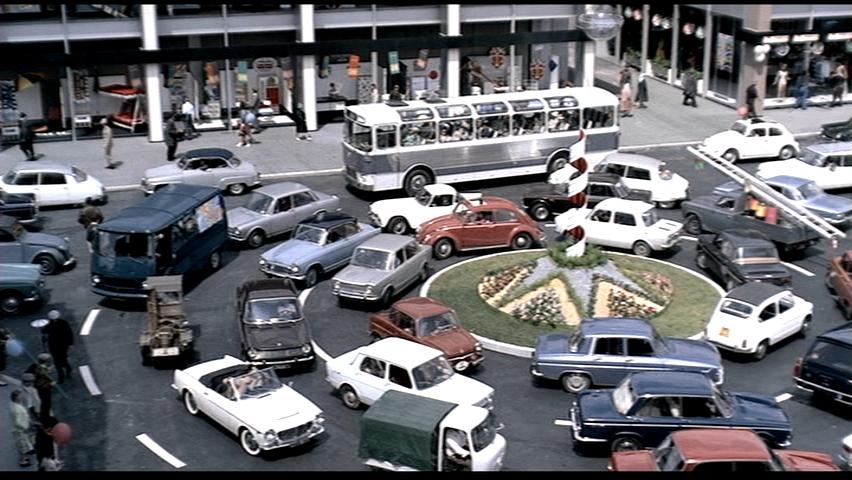 |
 |
 |
||
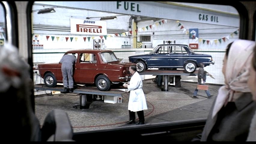
Milos Mladenovic -image set is ABOVE The three images here are all from the end of the film, the morning after the dinner, when the tourists are driving back to the airport to leave Paris. This is a particularly lively point in the film and is the resolve after the chaotic fiasco of the dinner party that precedes it. All three images are very unlike the beginning images of the film: this is not stale, artificial, ordered, manicured, consciously presented Paris. And of course they do not take place indoors, as of the scenes before them do. This is Paris the carnival. In the first image, the cars are circling endlessly in a roundabout, imbued with a sense of the natural chaos and happenstance of urban life. In the second, the tourists look out from their bus at what appears to be either a mechanic or fuel station at cars being inspected and going up and down on hydrolic platforms. The third image, similarly, has a technician in working clothes on a mechanical lift shouting to his colleague on the ground, trying to communicate with him, amidst a sea of cars below and around. The facade of the iconic modern buildings we have become so familiar with at this point takes up a third of the background. These scenes are all in stark contrast to the first half of the film, creating two great counterpoints essentially hinged by the dinner scene between them. On a basic level, the arc of the film in this way transitions from the sterile line to the fluid curve. This is not a modern Paris in which everything is controlled, designed, calculated, and trimmed of excess like the earlier scenes of the protagonist man lost in the modern buildings and their modern furniture exhibition centers. This is instead a Paris where things are happening slightly in a more "natural," unplanned manner. It's also slightly comical and less uptight than the rest of the film - where the dinner party gradually breaks down the sterility into utter chaos (literally the place is falling apart by the end), these images are completely free of restraint, residing in that world with which the dinner party culminates. There is a comical, carnival-like side to them - the cars are oscillating up and down, the mechanic appears like a cartoon waving to his colleague on the ground, and the cars circling in the roundabout create a caricature-like scene. And all of this is being seen by the tourists through their bus windows. It's a perfect close to the entire narrative on modernity, and ends the drive to the airport and the departure of the tourists, the end of their Parisian adventure, in a very appropriate tone.
|
|||||
7. |
 |
 |
 |
||
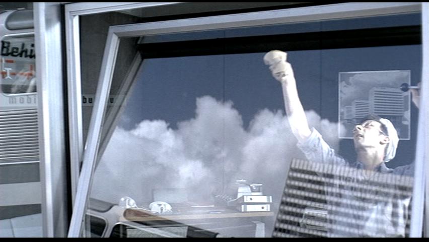
Kyle Jensen -image set is ABOVE The three images that I am investigating this week all have a common link which involves the design of modern furniture. The writers of the film add comedy to the plot by poking fun at modern design. ! ! The first image shows the protagonist inspecting the chairs of a waiting room. Everything seems fairly standard until he presses on the upholstery, air is then squeezed out of the seams, creating a vacuum within. The comical aspect is the air’s amusing popping noise as the fabric expands to let air in again. Multiple other times during the film the same designed chair makes this noise, becoming increasingly hilarious the more times it happens. The second image shows a man falling off of a bar stool. The stool itself is fairly tall making it easy for a drunk person to tip it. The design of the stool is modern in its fabrication, boasting steel construction that appears very stable as the legs do taper to a wider stance at the bottom. But again multiple times the stool is toppled by an intoxicated bar patron, creating comic release as the person is quickly ejected out of the club as soon as he becomes to drunk to sit on the stool. Also the stool was flipped around creating a standing enclosure for a drunk man to stand. This also created comedy as the man was then held up by the stool creating a standing aid out of the same tool that was used as an indicator of a man’s soberness. The third image shows a crowded dance floor with couples enjoying the music. The circle is emphasizing a mark that the poorly designed modern chairs of the club leave on its patrons after sitting at the tables. The chairs themselves were designed with a trident looking prong for the chair back. Again the chairs are steel with very fine rods coming to a point at the top. It seems like a poor finish may have been applied to them as on both bare skin and fabrics show an impression after the person leaves it. In all three cases modern furniture is seen to be subpar or quirky because of an aspect of the design. I feel that the film maker is poking fun at the sleek lines and minimalist concepts of the pieces in this movie. I was also interested that there was only one alternative as far as furniture, making an interesting statement of availability in the market when the movie was made. The idea of the clean lined approach to buildings and furniture is seen to be a negative and comical extravagance as the buildings are hard to navigate and the furniture functions poorly.
|
|||||
| 8. | 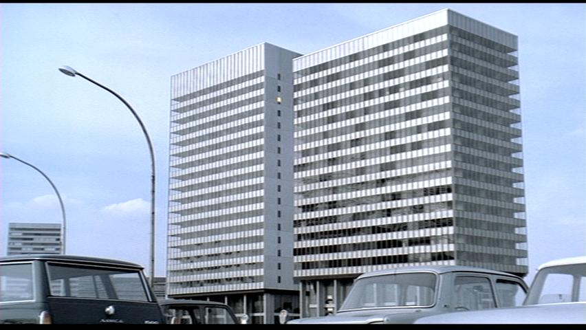 |
 |
 |
||
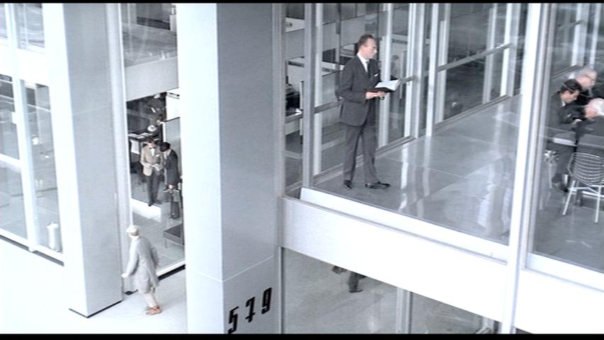
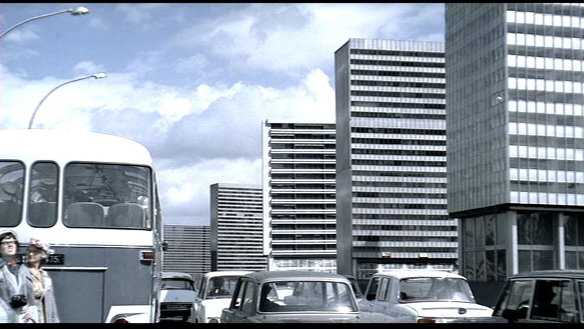
Arturo Morales Rivera -image set is ABOVE By the time that Playtime premiered in 1967, Tati was already a known critic of modern technologies and architecture. Almost ten years before, his film Mon Oncle was a well received critique to postwar France in its road to modernism, contrasting it against the old neighborhoods of Paris, where monsieur Hulot -Tati’s most famous character- lives. On this particular film, the plot centers around the mishappenings that Hulot has to deal with while visiting his sister’s new and technologically advanced house, while portraying his view of modern architecture as rigid, dull and bland, all done in a very clever and humorous way; to positively illustrate this statement Tati proceeded to design and build The Villa Arpel along with painter and long-time collaborator Jacques Lagrange in a studio in Nice, France. Fast-forward to Tati’s next film, Playtime. Production began on 1964 with the construction of the set that came to be known as “Tativille”, which would also end up becoming the real star of the film. There were around 100 workers involved in the construction of two buildings with an approximate total of 340 sqm of glass, 3595 sqm of plastic, 2926 sqm of timber and 45,150 sqm of concrete. The set was so elaborated that it had its own roads and electrical systems, as well as a full functioning elevator in one of the buildings.¹ Some of the other office blocks shown in the background during the movie are in fact on wheels and tracks that could be easily moved around in order to satisfy the vision of the director.² To help with the desired effect, Tati also employed long shots to allow a panoramic view of the architecture, making it the center of attention. The film continues with Tati’s commentary on the lack of character and spirit of modern architecture, which becomes very clear with the design of the office buildings, displaying a very orthogonal and repetitive language in their overall shape, color and materials, inspired by the ESSO tower, built in 1963 in La Défense, a business district in Paris. This can be further evidenced by the posters hanging on the walls of the travel agency during one of the scenes, showing practically the same buildings in each of the different destinations and presenting only subtle differences according to the place that the poster advertises, for example, a sombrero on top of a building with a title that reads Mexico. In turn, this becomes an interesting nod to modernism taking over the world. As well as the visual impact created by the sets, Tati also relied extensively on soundscapes to create and portray the adequate atmospheres required by the scenes, blending the sounds of the city such as traffic, construction workers and street vendors with the dialogues of the characters, sometimes even losing them mid-conversation in order to allow a feeling of chaos and noise to take over the scenes. Besides Tati’s humorous style and creative soundscapes, as well as the complex narrative and plot, the exploration of his idea of a modern city and how it affects the people as they slowly adopt the rigidity of the buildings still prevails to this day. Sadly, Playtime also became famous for being a massive commercial failure because of its massive and expensive set, driving Tati straight into bankruptcy. Either way, his legacy remains untouched as his films are regarded today as great achievements in the industry, proof of this being the fact that Playtime was regarded with the 42th place in the critics’ list and the 37th place in the directors’ list of the British Film Institute Top 50 Greatest Films of All Time.³ References ¹ IMDb Playtime Trivia: http://www.imdb.com/title/tt0062136/trivia?ref_=tt_trv_trv
|
|||||
| 9. |  |
 |
 |
||
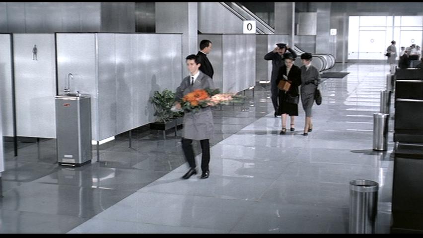
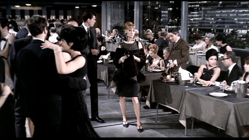
Morgan O'Reilly -image set is ABOVE In these three stills taken from Jaques Tati’s 1967 film ‘Playtime,’ the difference between the tourist and the citizen in what might be considered modern society have been highlighted. The film casually follows the activities of a group of American tourists on a day out in Paris. In the first image this group of tourists is shown in their hotel on a ‘down’ escalator, headed out for the evening. On the opposite ‘up’ escalator a tired looking group of tourists appears to be returning to the hotel from their day of site-seeing. In this modern, nearly unrecognizable version of Paris that was entirely constructed for the filmi, the viewer is repeatedly shown the absurd relationship between people and a modern environment in which everything has been standardized. The management of the tourists is part of this standardization, which is clearly exhibited in this still. The Americans are moved around in tour groups, directed by guides, as well as the architecture, from one space to the next, often shown being directed onto these escalators. They are treated like a product on a conveyer belt or a herd of cattle being shuffled from one location to the next completely oblivious about where they are going next and only aware of what immediately surrounds them. Here these analogies are made explicit, as we see one fresh group being moved out and a worn and tired group being moved back in for the night. In this second image, two of these American tourists have just excitedly agreed to dance with two French men at the restaurant/dance club. This table of tourists entered the restaurant as a large loud group that was immediately corralled by waiters off to the side, away from the Parisian diners. They receive negative attention from the local clientele who make comments such as “how tourist” and “it’s a flood of tourists”. Particular attention is given to the green colour of one of the tourist’s dress. The dresses worn by the American women in this still stand out from the neutrality of the crowd and setting, as does their attitude. The woman in red seems especially excited by the prospect of dancing and joyously ignorant of the demure disposition of the locals around her. In this modernized world, uniformity is synonymous with sophistication. The tourists are portrayed as unsophisticated as they do not integrate into the overly designed surroundings. The locals, on the other hand are integrated to the point that they become part of the setting and part of the sites that these tourists are viewing. The third still image demonstrates this idea wonderfully. A stylish Parisian woman gets her heel stuck in a crack in the floor as she struts across the restaurant. Rather than acknowledge that her heel is stuck by showing some sign of surprise or embarrassment, she attempts to discretely and gracefully wiggle her shoe out of the crack before continuing to sashay across the floor. It’s as though admitting to any kind of altercation with this modernized world, would disrupt the conformity and be uncivilized. This theme of adapting to the built environment, rather than the built environment accommodating the occupants, is consistent throughout the film. While the tourists seem to accept the inhumane quality of the architecture as part of the foreign world that they are exploring, the locals embrace it without question as part of modern life. Both cases result in absurdity and an extremely amusing commentary on modernity in the 1960s. i Roger Ebert. “Playtime (1976).” http://www.ebertfest.com/seven/playtime.htm OTHER REFERENCES Canby, Vincent. “Playtime.” New York Times, June, 1973.
|
|||||
| 10. | 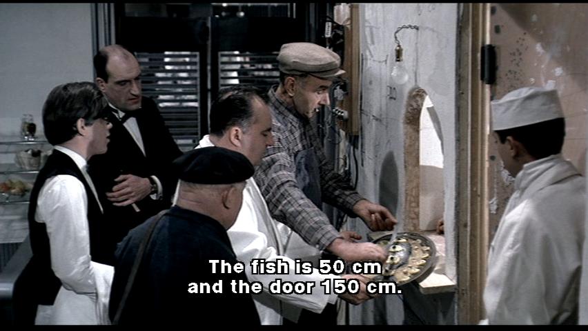 |
 |
 |
||
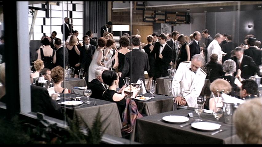
Patrick Rossiter -image set is ABOVE Each of these scenes occurs during the Royal Garden sequence part of the film. This sequence takes up almost the entire second half of the film. At the restaurant, Hulot reunites with several characters he has periodically encountered during the day, along with a few new ones, including a nostalgic ballad singer and a boisterous American businessman.i The resolution of the 70mm film is terrific and these evening scenes are a great display of the high quality film and audio recording processes. Tati chose to shoot the film on the high-resolution 70 mm film format, together with a complicated stereophonic soundtrack.ii The custom built sets which Tati had constructed display well in the restaurant scene – capturing it from many vantage points and using it to its full potential. The use of stereo sound recordings works together to make what was probably at the time a hyper realistic experience for the audience. Almost the entire film was dubbed after shooting; the editing process took nine months.iii Tati consistently keeps his 70mm camera beyond arm's length and clutters his soundtrack with random and overlapping snatches of dialogue, musique concrète, and gonzo sound effects.iv Scene 1 – 1h05m This is a comical scene where the restaurant employees and the carpenter analyze the basic problem with the food pickup window from the kitchen being too small as the platters food are served are fairly awkward and hard to work with. The stereo sound technique combined with the dubbed dialogue offer a layered story to be communicated in one simple scene. When viewing this scene the stereo sound is used very well offering all of the sounds of a busy kitchen on the upper right side of the sound scape. On the center and left are the conversing characters, all contemplating an elementary problem and finally the concierge simply implying that it is unnecessary to modify the window size, but to simply use the door. The waiter moves towards the door only to almost be hit with it swinging out. The fact that everything is coming together quite horribly allows humor to rise to the front – at this point in the film things start to unwind – the restaurant is slowly filling up and issues continue to arise. At this point in the film, all the tension that may have been building can be released as people begin to relax. When listening to the sounds of this scene you canhear all the intricate elements that have been added – for example when the tool box of the carpenter is set down the sound of a wiggling saw can be subtly heard – this is a sound that is easily associated with the jokes of cartoons, comedy, etc. Scene 2 – 1h28m During this part of the restaurant scene several ongoing jokes continue to unravel: - A waiter who ripped his uniform plays maybe the most important or standout role as the scene comes back to him every few minutes to continue the joke. As he hides behind a column in embarrassment of his uniform, he communicates with another waiter to help him out and in turn as other waiters uniforms malfunction they all go to him to leave him with the defected outfit parts and take his undamaged ones. - The doorman who had to deal with the glass door shattering had been pretending it was still there and holding on the brass door fixture floating in the place. He continues to provide this service and create the illusion that everything is going well but he is stressing out – in this scene the doorman is going to the barman with the brass door handle in hand, looking for a shot of something to round the edges and calm his nerves. The barman slyly sneaks him a shot of alcohol. Tati’s ability to express his discontent with modern conventions of living are made obvious during this scene. Modern industrial technologies, accepted as necessary by society, are represented by Tati as obstructions to daily life and an interference to natural human interaction.v The stereo sound continues to offer more story than meets the eye as conversations and music mix together. In this part of the restaurant scene, as the jazz musicians have started, characters start to become more real and less robotic. The use of the continuous jazz music track that meanders through instrument solos is a great technique to let the scene float around and give the impression of a more relaxed atmosphere. Scene 3 - 1h23m This shot of the restaurant is a tell all shot – it provides a great amount of detail and allows the viewer to continue being a voyeur. There's such depth of content in each setup.vi It is a well-lit shot looking inward and inside the restaurant. The lighting is perfect at giving the impression of being outside a busy restaurant. Tati ensured that the viewer would be immersed in a world that is absolutely real in its appearance. The centerpiece restaurant sequence alone took nearly two months to shoot.vii It is during this scene that the jazz band begins performing, they are the straw that breaks the camel’s back and allows the characters of the film to open up, to move more freely. The restaurant scene is a terrific summation of Tati’s subtle humor techniques in this film. As stated by the late Roger Ebert, “The last long sequence in the film involves the opening night of a restaurant at which everything goes wrong, and the more it goes wrong, the more the customers are able to relax and enjoy themselves.”viii i Playtime, February 15, 2014, http://en.wikipedia.org/wiki/Playtime ii “Playtime”, August 17, 2009, http://www.slantmagazine.com/film/review/playtime iii “Playtime”, August 17, 2009, http://www.slantmagazine.com/film/review/playtime iv “Playtime”, August 29, 2004, http://www.rogerebert.com/reviews/great-movie-playtime-1967. v Playtime, February 15, 2014, http://en.wikipedia.org/wiki/Playtime vi Playtime, February 15, 2014, http://en.wikipedia.org/wiki/Playtime vii Playtime, February 15, 2014, http://en.wikipedia.org/wiki/Playtime viii “Playtime”, August 17, 2009, http://www.slantmagazine.com/film/review/playtime
|
|||||
| 11. | 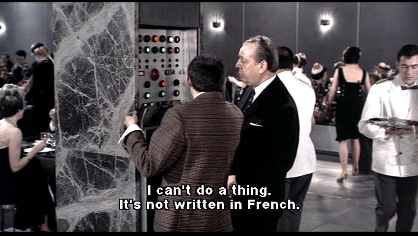 |
 |
 |
||
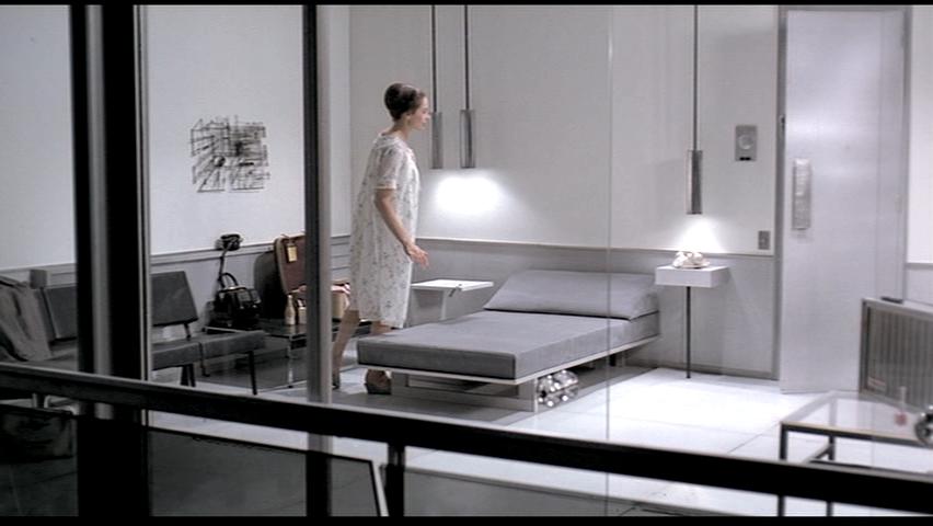
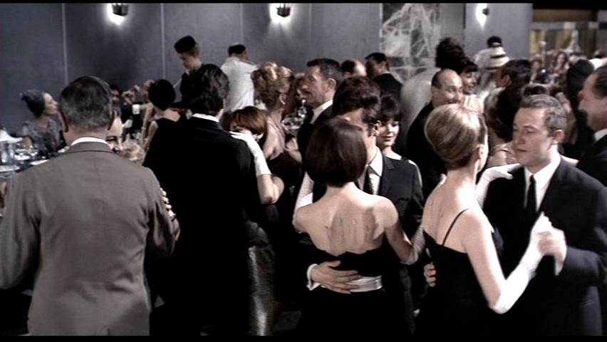
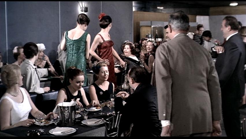
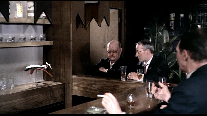
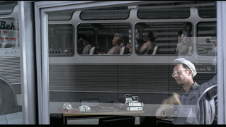
Simone Tchonova -image set is ABOVE The three images shown above are from Tati’s movie “Playtime” during the second half of the film in the dinner sequence. One of the main characteristics of this movie is the differentiating contrast between the two main groups of people the tourists and the “modernized” Parisians. The tourists are a bunch of clumsy, seemingly naive people attempting to experience the Parisian modernity. Then there are the calm, assertive locals who seem to casually carry on with all their daily tasks in the background of scenes. It is not until the chaos of the dinner sequence that the ignorance and lack of expertise of both the locals and the tourists is brought to light. In the first image there are two men who are affiliated with this “posh” restaurant. One would expect these men to know their way around the panel of light switches, breakers, control buttons etc to have a smooth running restaurant business. Neither could seem to find how to put the temperature down (a somewhat simple task). Imagine not knowing how to put down the heat in your own house this would be quite embarrassing. The second image shows a couple dining together. It is important to look carefully at the details the imprint on the womans naked back. The chairs in the restaurant have been custom made for the restaurant with the backs in the form of a crown (the logo of the restaurant). Everytime that someone is leaning against the chairs for a long time this logo is imprinted onto their backs. As many women are wearing backless dresses, they have this crown imprinted on them making them seem quite silly. It is secure to say that the diners are attempting to have a lavish, posh dinner as a modern Parisian might be thought to. Yet this image quickly crumbles as these funny patterns are embedded onto their backs. The third image depicts two men having a conversation at the bar. What is not shown in this image is that the man on the left is sitting in an upside down bar stool to his intoxication. What seems to be normal from one angle is complete ridicule from another. In all three images the naivety and ignorance of everyone in the film is displayed by the fact that each image has other people in the scene who seem completely careless and inattentive of the obscurities occurring directly around them. The situations are in effect more humorous than a portrayal of “Modern” Parisian lifestyle.
|
|||||
| 12. |  |
 |
 |
||
Yiming Wang -image set is ABOVE
|
|||||
| 13. | 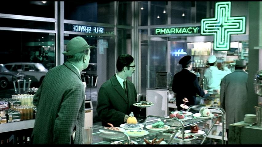 |
 |
 |
||
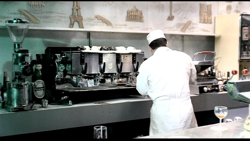
Victor Zagabe -image set is ABOVE The first image showcases Tati’s experimentation with the reveal of material properties through the use of sound. Evidently, the loud buzz which eminates from the fluorescent green light serves to provide a particular atmosphere of emptiness, a stale and fragile environment whose nature of stillness is easily disturbed. The use of the green hue , when combined with the sounds created, create a compelling and alienating feel to the space. One simply does not want to linger in such a space. Every collision caused by a person’s movement with a material such as the foot with the floor, or a plate on the countertop is carefully tracked due to the film maker’s use of sound effects. The same can be said for the second image in that the hardness of the working surfaces are further emphasized due to the low amount of background noise in the scene. The contrast in the overall hue of the dining space and the preparation space The way in which the green hue creates a divide between the dining and the preparation spaces serves to create a kind of social division between production and consumption. The red accent seen in the third image serves to contrast the other two in the sense that it now becomes a mere highlighter of the key people in the scene, without creating any sense of atmospheric effect due to sound. The atmosphere is created, instead, by the extras in the background.
|
|||||
| 14. | 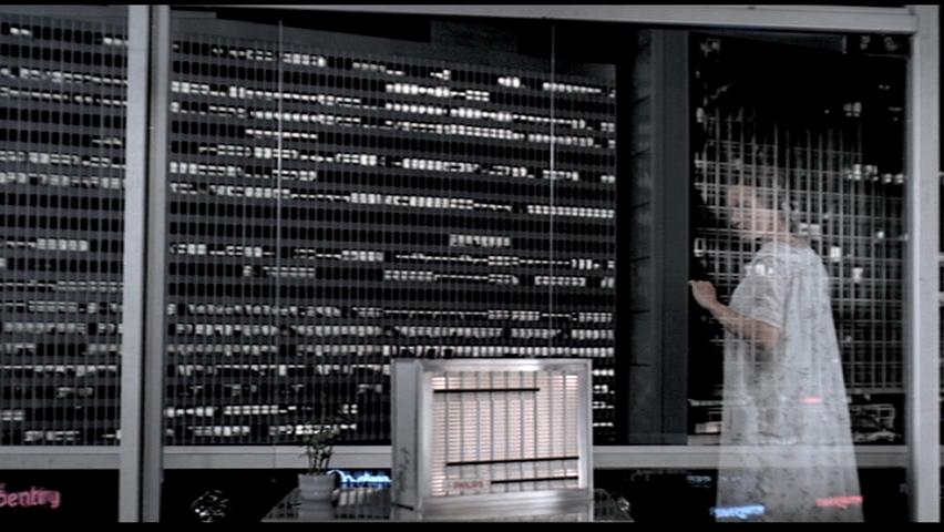 |
 |
 |
||
Wesley Chu - image set is ABOVE Tati’s “PlayTime” is a critique on modernism and its contemporary architectural stylings. As it is entirely shot on built sets, Tati has incorporated steel, glass, and concrete, the “holy trinity” of modernist architectural materiality, into nearly every shot. For glass specifically, he focuses on not only their division of rooms in space, but their visual effect, their brittleness, seemingly smooth and perfect surfaces, and their tactility. Glazing is unique in architecture as the material that allows sight across its bounds, but not movement. Tati never lets us forget this, showing shots of windows tilting and shifting its reflections, or a cleaner wiping a window with an unbearable squeak. The presence of this transparent, invisible material that is normality in the modernist society is suddenly brought to the visual forefront in the film. The lack of aforementioned glazing is equally important in the film, as shown later when the glass door to the restaurant shatters, leaving the doorman to only pretend that it is still there with the brass knob. None of the patrons notice, or even seem to care, except for the people in charge of maintaining the place. Tati’s focus on the physical makeup of the space we inhabit, experience, and move through begs us to analyze and pay more attention to the modernist world built around us and how it changes the way we interact with each other in the world. Is it making for a cold, emotionless atmosphere with a solid, monotone palette that is built like a maze where we can easily get swallowed up in and lost? Because Tati seems to believe that the invisible barrier of glass adds to this atmosphere.
|
|||||